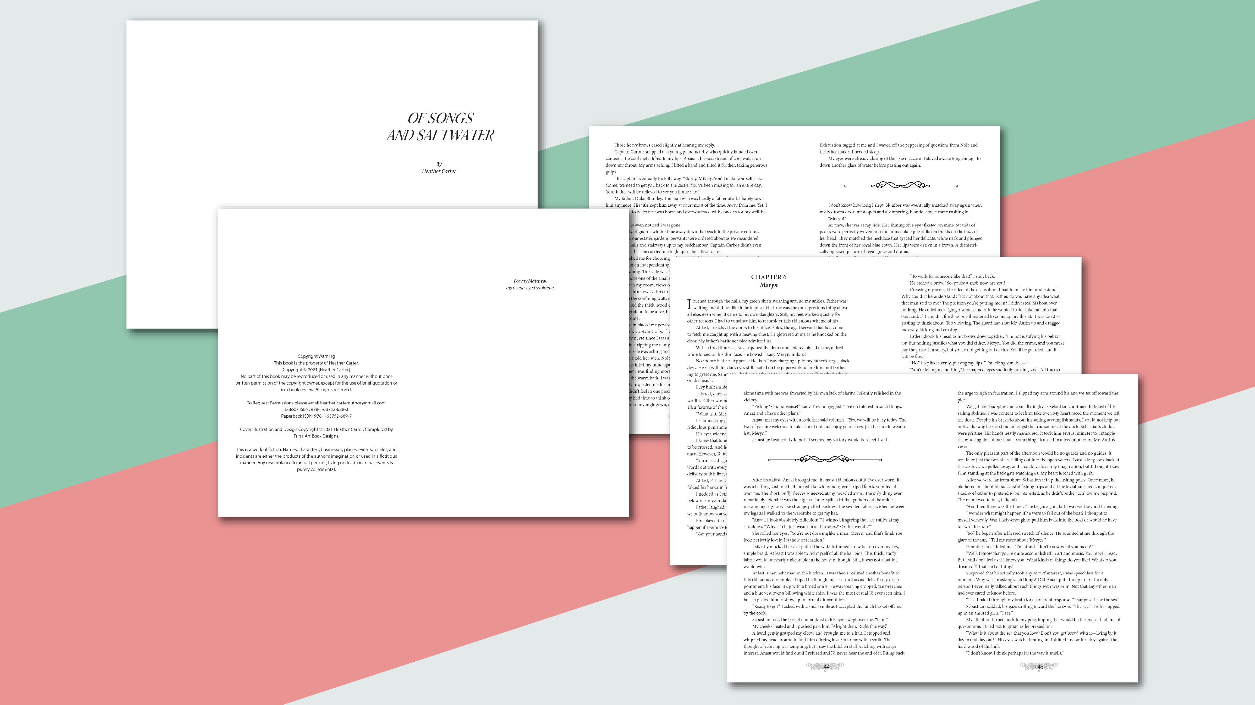
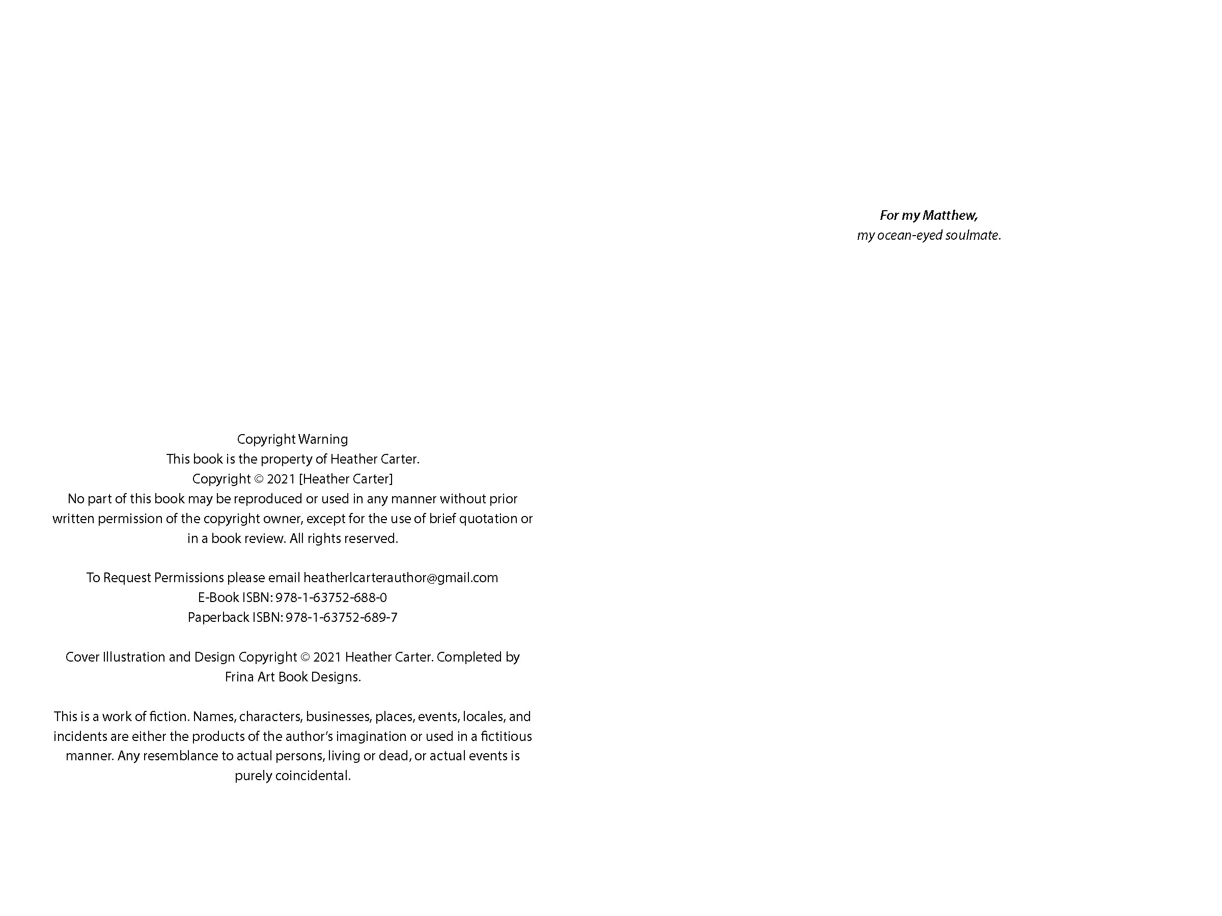
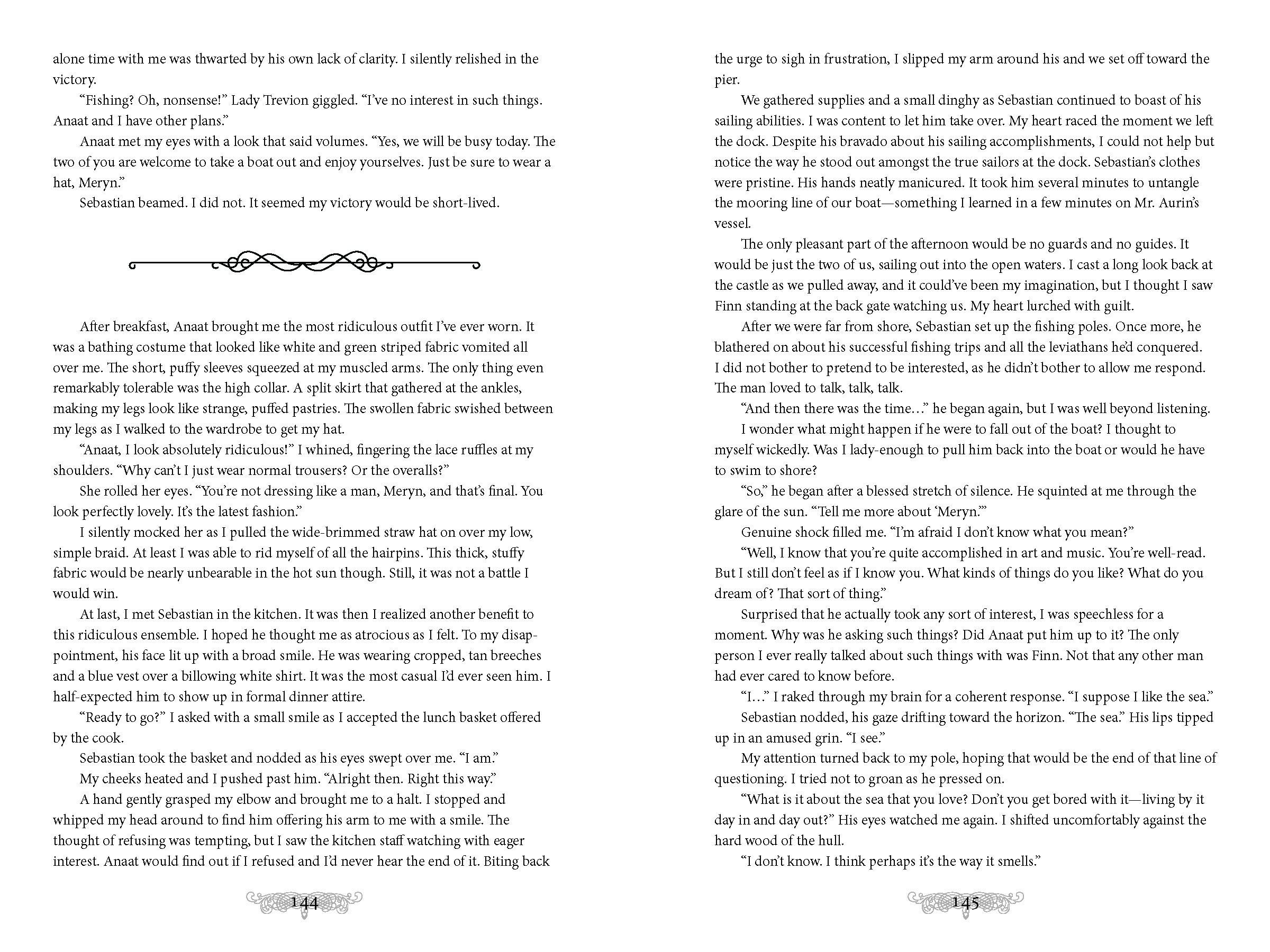
When a friend of mine wrote one of her books, Of Songs and Saltwater, I jumped at the opportunity to help her with the internal layout of it!
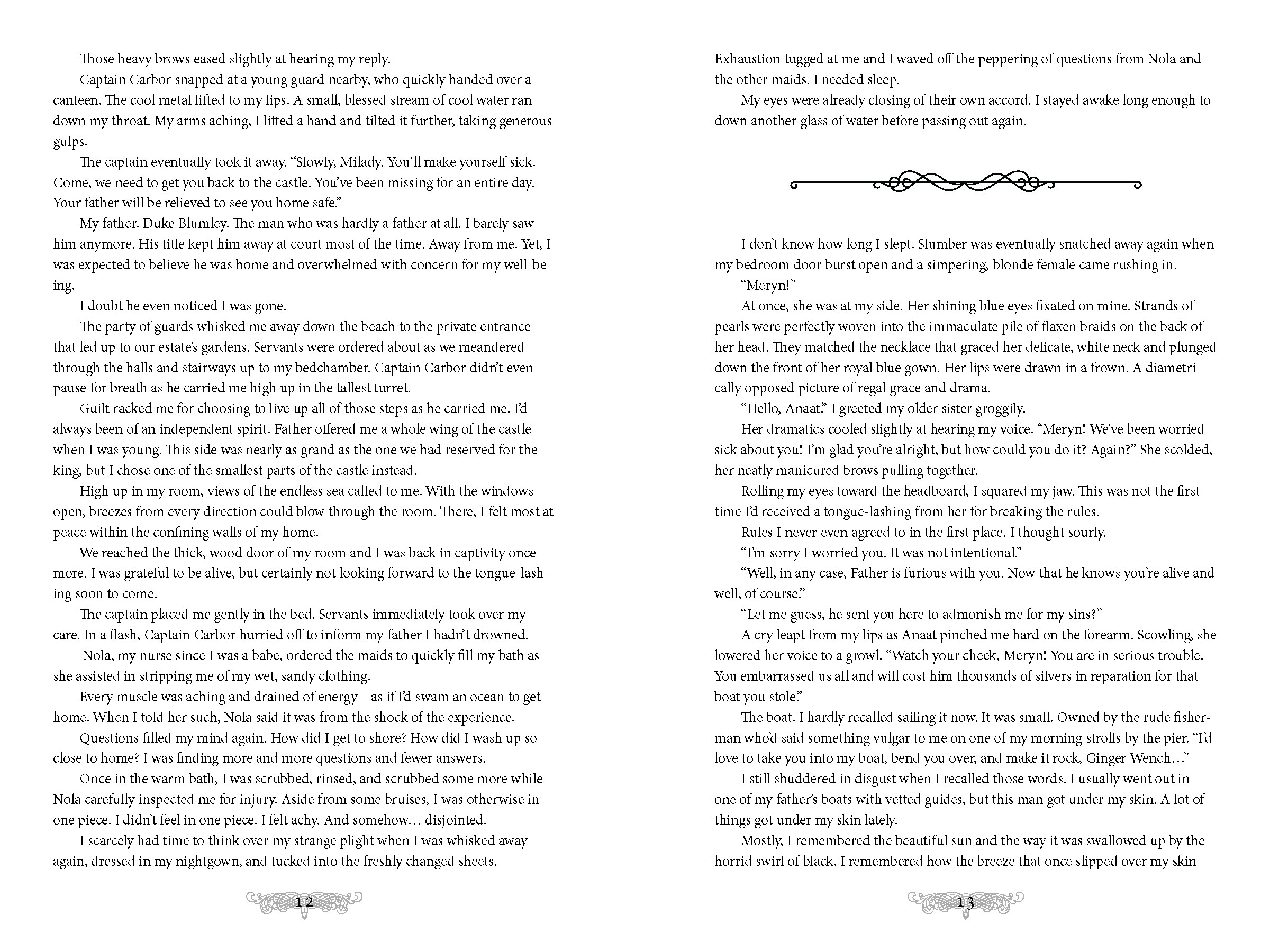
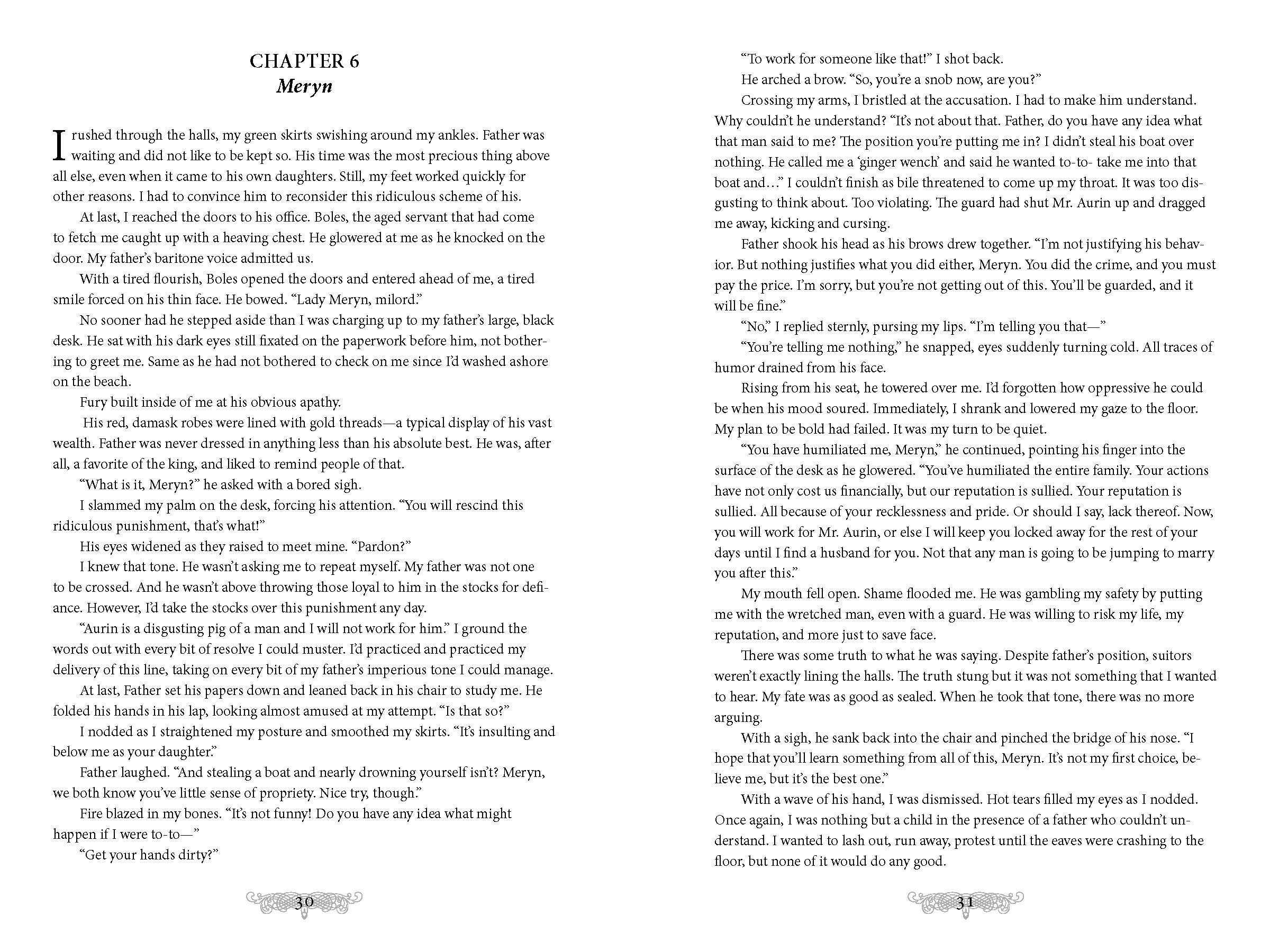
We chose a nice, serif font for the body of the work because such fonts have been said to read easier for long-format text.
Her book also includes some songs that she wrote, so those are offset from the bulk of the text.
We finished off the layout with some flourishes between sections, as well as some embellished page numbers.

